Degenerate music and Nazi Germany: a love/hate relationship

I stumbled upon the poster for the Degenerate Music exhibition (Entartete Musik) held by the Nazi government, beginning in 1938, and was completely hooked by it.

Despite the fact that I never really understood the exactly reason a dictatorship would organize an exhibition of the music it had just prohibited, what really impressed me was the fact that the poster is surprisingly good:

249A

The poster for the first “Degenerate Music” exhibition. Unknown designer

The poster obviously tries to put together all the classic nazi prejudicies together: black people, jewish people, capitalism. However, the drawing is so appealing, the typesetting so well done, that I can’t stop wondering if the the designer that did it was actually enjoying the culture he was supposed to despise. Whoever drew this sinuous hard partying black-jewish-capitalist musician had a good time doing it: the careful use of the two colors and negative space, the sensuality of the lines, the JOY that emanates from the poster, they all betray the exhibition’s intent.

This apparent contradiction between the theme of the exhibition and the quality of the poster becomes increasingly obvious when you compare it to one of the posters for the analogue “Degenerate Art” exhibition:

"Entartete 'Kunst'. Ausstellungsfhrer" zur Mnchener Ausstellung 1937.

Poster for the Degenerate Art exhibition. Unknown designer

Well, this poster is clearly trying to show modern art as ugly, brute and well, degenerate. The kind of appeal that this poster uses is the same kind of appeal that horror movies, freak shows and grotesque entertainment in general uses: you will enjoy to be disgusted.

On the poster for the music exhibition previously shown, however, the appeal is completely different: the fact is that you look at it and feel that you could have a hell of a time with that kind of music. You enjoy it because this “nigger-kike” fella is super cool.

Krenek_Jonny-spielt-auf_Titel

Cover for the Opera’s vocal score

Looking for a possible explanation behind this intriguing beautiful poster, I came across the fact that it was somewhat particularly inspired by one of the forbidden Musical Works on the exhibition, the opera Jonny spielt auf (Jonny Strikes Up), by the Czech-Austrian composer Ernst Krenek. Even the character on the nazi poster is believed to be inspired by the image on the cover.

This opera is about Jonny, a black jazz player, and was wildly successful in Berlin during the late 20’s. In Austria, it was such a hit that a successful cigarette brand named after the main character existed for decades. Krenek, the composer, was apparently inspired to write the opera after watching some of the many jazz bands that toured Germany during the Weimar republic, like the Chocolate Kiddies picture below.

Jonny Spielt Aufmage1

Sam Wooding’s in front of a poster for his Chocolate Kiddies band concert in Berlin, 1925

This whole story shows how a big part of Germany’s cultural force had interest in black-american music and culture,  only 10 years before Hitler’s ascension to power.

If we follow this path, the fact that the artwork has more in common with the promotional poster for the Chocolate Kiddies german tour in the 20’s than with the “degenerate art” poster doesn’t seem that awkward.

I t is quite possible that all this complex relationship of love and hate between Nazi Germany and black-american culture bled into the poster for the “Degenerate Music” exhibition. I like to think that the designer couldn’t help but enjoy the energy of the music and its symbols, and produced a work that is rather ambivalent.

A last remark, I’ve come to know that between the “degenerate” music pieces were works by Gustav Mahler, Kurt Weill, Duke Ellington. What a hell of a great place to be, this “degenerate music” exhibition!

Thoughts on modernism #3: ideals and reality

Michael Tilson Thomas, conductor, talking about the reaction to
Modernism in music after it was adopted by fascist states during the 30’s:

Screen shot 2013-02-20 at 12.24.17 Screen shot 2013-02-20 at 12.24.19 Screen shot 2013-02-20 at 12.24.21 Screen shot 2013-02-20 at 12.24.25

Taken from The Sound and the Fury: A Century of Music, a BBC Series on the revolution in 20th century music. In this particular episode, the series looks at how modernism came under state control in the 1930s and how a new generation of composers tried to reinvent it.

A remark to myself: I keep finding these criticisms about the limitations and the dangerous implications of modernism, and still, in the design field (talking specifically about the professionals, rather than the writers), it is usually seen either as a sacro-saint entity, of something cool that “is kind of old, done gone”. Either way, it is never criticized in a constructive and coherent way as in other fields. Why is that?

Quote #3: Goethe and the Weltliteratur

“Perhaps people will soon be persuaded,” Goethe wrote in 1826, toward the end of his long life, “that there is no patriotic art and no patriotic science. Both belong, like everything good, to the whole world and can be promoted only through general, free interaction among all who live at the same time.”

Johann Wolfgang von Goethe (1749 – 1832),
quoted by Greenblat in Cultural Mobility: a Manifesto

Some thoughts on LCC Final Projects Exhibition

I’ve been to the London College of Communication for their end of the year exhibition, gathering the work of MA students in Information Design, Branding and Graphic Design.

It was impossible to really get into each project, as the number of students was overwhelming, but I managed to engage with some very nice ones.

You’ve got Mail, By Di Xia
Di Xia proposed to redesign commercial e-mails she received by using only calligraphy and hand illustrations. The resulting e-mails are wonderful, and really brought me into thinking in the implications of digital design, the loss of human touch, and the power of calligraphy.

IMG_1422

IMG_1423

IMG_1424

Police Dichotomy, by João Nabais
João basically studied how the perception of Police officers by others oscillates between fear and security. The symbols of the trade such as the clothes, helmet and guns sometimes obliterate the human being behind it, causing a greater distance between people and agents of law. João tried to design ways to raise awareness and overcome this dichotomy.

IMG_1425 IMG_1426 IMG_1428

Whitebored, by Riccardo Bardzki
Riccardo tried to create this “open-source” brand of boardgames, where you can customize your own set of rules and also the white elements of the game. I don’t think this concept really holds water, but I believe his proposal was successful in another level: it is a nice piece of conceptual work that raises interesting questions about the limits between boredom and fun, playing and waste of time.

IMG_1445 IMG_1446

About the exhibition curation and assembly

Overall, I thought that the exhibition was too large, with each work having too little space to make their point. There wasn’t enough room for any of them to affirm themselves individually, so I felt like I was flickering through a rather beautiful but inconsistent single exhibition.

Also, the absolute majority of the students presented their works as books, and I don’t really believe that was the best way of presenting work for an audience. There isn’t much sense on putting a branding project – which usually require mood-boards and poster size images to get the idea through – into a tiny book with small images and a sequence of pages that never allow me to grasp the project as a whole.

I believe there is a lesson to learn here, for us at Chelsea that are going to hold an exhibition later this year…

Project #2: Map Project

For the map project that we built in Triangle Space, I chose to do a map of Brasília, my hometown and Capital of Brazil.

When we were modern: Brasília promised a future that never arrived

When we were modern: Brasília promised a future that never arrived

The city is the epitome of Modernism in Brazil: it was planned to be a modernist city from scratch, heavily controlled by a grid, pre-determined use of space, sector’s divisions, etc. On top of that, the city was added to Unesco’s World Heritage list, which resulted in a even greater attachment to the plan originally conceived by Lúcio Costa, Juscelino kubitschek and Oscar Niemeyer.

However, behind this love for order, rationalism and minimalism, lies a story of politic authoritarianism, violence and irrationality. During the construction of the city, thousands of workers died because of the tight schedule, long journeys of work and lack of security assets and training.

Later the town was the symbol of the dictatorship that took Brazil from the 60’s until the 80’s. Extreme inequality and a subtle but very efficient apartheid between rich and poor also stained the modernist Utopia, at the same time that post-modernism questioned the basis of the modernist movement in architecture and design.

Therefore, I was interested in mapping Brasília in a way that could adress these contradictions, make them explicit. I summoned the questions raised by my research in two sentences:

– A neurotic attachment to a rational plan leads to irrational and barbaric actions to finish it on time.

– To keep up with a plan designed 50 years ago and try to bend reality and people to fit it, ignoring the changes, is irrational in itself.

These concepts guided my tests, which ended up in two projects, one of them not completed.

1. BRASÍLIA MODEL BLOCKS VANDALIZED (completed) 

The Model Residential Blocks in Brasília were designed to have everything a citizen might want: blocks for poor and rich people, a church, a school, a neighborhood club, local business. And this model citizen, in this model block, would be able to do all of it by foot, without using the car.

The plan never really worked, though. Prices skyrocketed, and poor people never lived in the intended buildings, which became houses for rich families. Also, people put their children in private schools, and the local public schools were used by their maid’s kids.

To express this difference between the beautiful plan and the harsh reality, I decided to draw the original plan as faithful as possible, in a “auto-cad” style, using isometric projection. It took me two nights to do so, detailing every feature that would later be distorted or never implemented.

The artwork before being vandalized.

The artwork before being vandalized.

I later hanged the map on the wall of Triangle Space, perfectly drawn and framed, but the work was not done yet: the second part of the work was supposed to have a “performance” feel to it: I would vandalise the work on site and write over it everything that went wrong with the plan. I wanted it to be dirty, organic and human, opposed to the coldness of the plan.

Beginning to vandalize the whole thing.

Beginning to vandalize the whole thing.

The map after it was vandalized.

The map after it was vandalized.

Outcome: Self Critique

The process of vandalizing the plan of my city, exposing its contradictions, was extremely cathartic. Everything that I ever thought about the city came out in a single flow of energy, full of anger. However, I think the final result was not good. I don’t think that the shock, the anger and revolt I fet and wanted to convey was effectively expressed. I don’t have experience with doodling and graffiti, and I think it ended up a little bit “unauthentic”.

Also, I guess that less intervention would be better: with so many layers of drawings, paint and writing, nothing really stands out.

Nonetheless, I am proud of the energy I put into it, and I enjoyed trying new techniques. Also, I really liked having a personal statement and involvement on a message with broad social and political implications.

In the end, I think that although my map kind of failed, it failed beautifully. That’s what matters to me.

2. NUMBER OF DECEASED WORKERS DURING
THE CONSTRUCTION OF BRASÍLIA, 1957-1960 (not completed)

Brasília was built in a incredibly tight schedule, because the important buildings and avenues had to be ready for inauguration before the end of Juscelino Kubitschek’s mandate as president, due in three years.

As a consequence, workers endured journeys of 17 hours a day, kids were hired without proving their age, security measures were non-existant and training was rare. In such conditions, it is no surprise that the number of deaths during the construction was extremely high, and the government hid the statistics for years.

I decided to convey the contradiction of the rational plan and irrational execution through an installation.

Rough scheme of the installation.

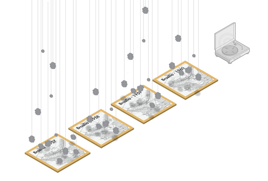
Rough plan for the installation.

On the floor, I would have four maps of the city one for each year of the construction. They would be on four square wood platforms.

Over each map, I would hang pieces of debris with transparent wires. It would be one piece of debris for each worker killed on that particular year, and each would have a “tag” with the name, profession and company the person worked for.

An old turntable would play the “Sinfonia da Alvorada”, an optimistic symphony composed by Tom Jobim and Vinícius de Moraes for the inauguration of the city. It’s optimism and sweetness would be a nice contrast to the maps, and I think it would cause the unease and discomfort I wanted to convey.

Outcome: Self Critique

Well, there was no outcome, so I can only judge my plan and some tests I did. I realized I couldn’t deliver such a complex installation on time, so I decided to abandon the plan and only do the other map.

By my rough plan, I can see that I would have to be very careful with the style of the map to be placed onto the wood squares: they would have to be in the style of the maps of the time. I collected debris, and felt it would be very beautiful to see them hanging, which I verified with some tests.

I still think it would work quite well: you could either read precise information (by counting the number of debris, or reading the name of the workers dead) and more subtle and emotional messages: the cruelty and coldness of the plan, the contradictions involved, etc.

However, there are many micro-decisions to be made about the final product that can make it work or totally destroy it, and I will only know if I ever try to put it in practice again.

Thoughts about Modernism #2: Grids and cruelty

From all the impressive things in Berlin, the one that impressed me the most was the Holocaust Memorial, right in the heart of the city.

Holocaust Memorial by night, taken on december, 2012

Holocaust Memorial by night. December, 2012

I visited it on a cold night, and I felt terrible walking through those uneven cold stone blocks. They convey a terrible sense of distrust, fear and unease, but what impressed me the most was how every block was perfectly aligned with the rigid grid of tiles on the floor.

memorial

Detais from the tile grid of the memorial, photo from here

That attachment to precision, matched with the overall heavy feelings, disturbed me a lot. After I got home I researched about the monument and found the project plan by the architect Peter Eisenman, where he proposed the monument to represent a supposedly ordered system that has lost touch with human reason.

What was ultimately disturbing for me was how much this quote, written about the nazi system of destruction, could well be applied as a criticism for other systems that put themselves above the human, like Modernism.

holocaustMemorial-751304

Holocaust Memorial, photo from here

This thought stayed with me for a few days and was revived when I visited a WW II Bunker still intact. Walking through its corridors, I realized how similar was the rational typeface used on it and typefaces still in use in the city’s underground system.

berlin-underground-bunker

Berlin Underground Bunker, Gesundbrunnen underground railway station, photo from here

09-potsdamerplatz_6145

Typeface on Postdamer Platz underground Station, photo from here

Some things just refuse to die.

Quote #1:

Nezar AlSayyad is a Professor of Architecture at Berkeley  and President of the International Association for the Study of Traditional Environments. His Berkeley page introduces his ideas:

As an architect, planner, and urban designer, I believe that architecture cannot simply be about self-expression. Instead I see its mission as the attempt to capture the culture of the place within a framework of poetic sensitivity and political position. I believe in architecture as the art of narrative, or good story telling. It is my conviction that architectural projects should be conceived as sound arguments.

As an architectural historian and theorist, I believe that buildings and their surrounding contexts often communicate these embedded propositions and assumptions. As an urban historian, I believe that history is always written from the present moment and often in the service of it. As such there is no history that is innocent of contemporary demands.

From this perspective, it is my conviction – as may be evident from my writings – that history is neither the knowledge of things that have occurred in the past, nor the memory of these past events, but rather it is the convergence of these events with certain individuals or communities and in specific places as interpreted by others who are usually removed from the time and place of these events.

I am trying to find a way to approach Graphic Design Communication with at least a hint of such a view: heavily influenced by Cultural Studies, Post-Modern to the bone and willing to expose and accept (and invite the audience to do the same) the assumptions and pre-conceived ideas behind any piece of design.

Week 3: Eduardo Bachs, the sweet revolution

One of Bachs' iconic movie posters

One of Bachs’ iconic movie posters

Eduardo Muñoz Bachs was born in 1937 in Spain and emigrated in to Cuba with his parents during the II World War. He worked with advertising in the pre-revolution Havana, and after Castro seized power he became one of the leading designers of the cuban posters wave of the 60’s and 70’s.

Although not really an enthusiast for the revolution, Bachs stared to work for the ICAIC (Cuban Film Institute) in 1960, designing posters for the ebullient movie market in Cuba. During the golden period of the cuban poster production, designers had to deal with constant shortage of materials: sometimes only one or two colors were available. There was even a shortage of paper, which forced designers to print on re-used newspaper and incorporate the news printed into their design.

Poster for the movie "Machete"

Poster for the movie “Machete”

Designers also faced deeper cultural challenges. Until the revolution, cuban design was largely influenced by what was practiced in America. However, after the revolution and the embargo against Cuba, the island was isolated culturally and economically. Soon the USSR replaced the USA as leading economic and cultural influence. In that scenario, between isolation and the brutal force of soviet culture, that Cuba developed its cultural identity and its own graphic language.

Bachs created most of his work during those years, and his work is both a search for a personal style and a struggle for a national identity. Of all the great masters of Cuban Poster – Roboiro, Rostgaard, Azcuy – Bachs was always the sweetest, the less political, the illustration-driven. His work blends the tradition of spanish editorial illustration, psychedelic influence from California and an exuberant naivety of a young country.

Most of Bachs work completely ignores the western rules for “designing a poster”. He approached his posters as if they were big illustrations: he usually drew the type by hand, integrated with the illustration, and kept the amount of textual information to a minimum. The resulting images usually have an incredible appeal, a fresh and wild sense of wonder.

His poster for the movie Por Primera Vez (for the first time), is a great example of his style. The movie is a documentary about the “moving cinemas” created by the revolution: ICAIC promoted movie sessions in small cities and rural areas, mostly for people that had never gone to te movies in their lives. The film is a touching lesson about the magic of cinema, showing the emotion and wonder of kids and adults watching a Charles Chaplin movie for the first time.

Poster for the movie Por Primera Vez

Poster for the movie Por Primera Vez

Although both the documentary and the movies screened were Black & White, Bachs opted for a incredibly colorful design. The poster depicts a free-style drawing of Chaplin, coming from behind a psychedelic garden. The colors, the amazing effortless feel of the drawing and the hand drawn type all come together in this incredibly arresting image. It conveys the wonder and excitement of going to the movies for the first time with such strenght, that one can hardly avoid smiling when he finds Chaplin in the middle of this dreamy garden.

The cuban revolution embittered after a while, and the naivety and hope of the first years are long gone. Bachs posters, however, are not outdated or misplaced. Their poetic energy has only grown, and their cultural value is now even more precious: they are a reminder of the creative power and hope of the cuban people. It may be dormant in the current socio-political conditions, but it’s not extinguished.